I wrote this poem in 2021 using the term “Heavy,” relating to things and situations in my life and experiences on our farm.
This piece was also the spring 2023 Baker-Starzinger Award Winning Poem presented through the University of Central Missouri. The guest judge selected the poem; Adam Vines is a published author, associate professor, and director of Creative Writing at the University of Alabama Birmingham. He also serves as the editor of the Birmingham Poetry Review.
I wrote this poem in 2021 about staying the night as a child with my grandmother and all the beautiful memories I still cherish and carry in my heart today about those adventures.
I wrote this poem in 2021 when my best friend, her husband, and her youngest son experienced the worst event—the loss of their oldest son and brother. June 12th, 2021, will forever be the day life stood still for so many people and catapulted everyone in my circle into a new way of living post-Ethan.
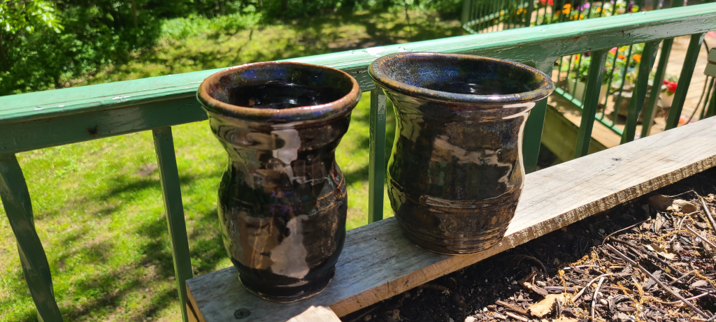
In addition to the multitude of art mediums I do, one thing I never get tired of is working with clay. Especially in a studio, hand-sculpting pottery pieces. I started working with clay and learning the craft of making pottery a little over a year ago. Pottery is not a craft for those who don’t have a great deal of patience. When creating pottery, keep in mind that the process is long and tedious in specific steps. You also need to be somewhat physically able to stand and use your arms and shoulders with ease. I do not have my own pottery studio; I created these pieces at State Fair Community College in Sedalia, MO, but there are a few local Kansas City studios.
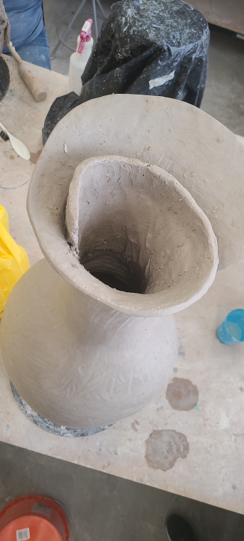
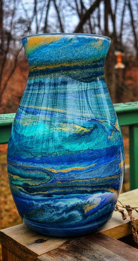
In one of my very first projects, I began crafting a three-foot-tall vase. It sits in my living room now, and everyone that comes to visit us always comments on it. This vase took around nine weeks to complete. For this project, I used a series of clay ropes. Clay ropes are used by potters when they roll out the clay to form long, rope-like strands of clay to mold and form together. Coiling pottery can be slow but well worth the effort. The clay best suited for coiling will have some grog mixed in it. Grog is a pottery term used to describe clay, including sand, tiny bits of seashells, or small fine rocks. This is to help prevent cracking, add texture, and reduce shrinkage, but it also aids in making the clay more workable for the process.
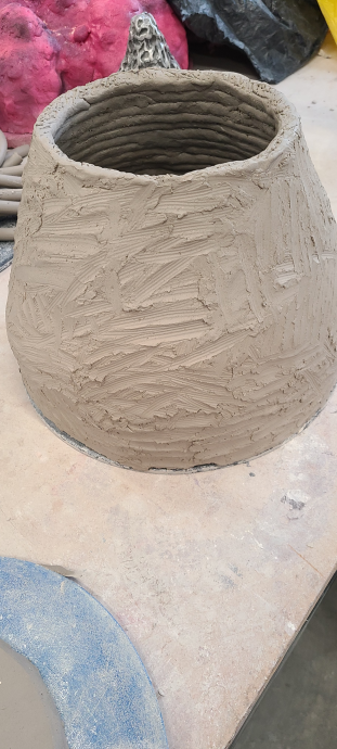
The first step is to create a series of clay coils and begin assembling them. I was taught to be as wide as possible in starting my circle for the vase. The reason is to provide support as I begin to bring the coils to a central connecting point. So, I started at the circumference of the potter’s bat edge. A “potter’s bat” is the circular disc often seen attached to a potter’s wheel. These were used as trays to hold our pots for the duration of the nine weeks of the project. I then began to slip and score the top edges of the coils with the teeth from a fork to connect the layers of clay ropes. Slip is another term used to describe heavily diluted clay in water. It is primarily water but tends to have a small amount of clay mixed in. Once I formed the vase bottom into about the shape of a beehive, I let it sit for two days under thick plastic, allowing it to firm up some to support the next steps. Coiling pottery is done in stages so it will not cave in and fall in on itself.
Beginning of coiling formed clay.
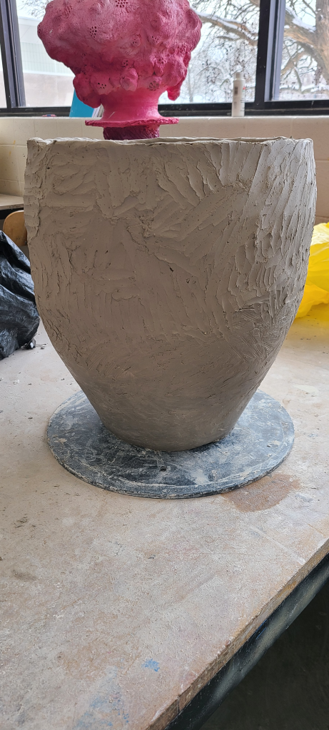
The next step was to smooth out the outer sides. I used a wooden modeling tool to smooth the edges and connect any seams between the coils. The next step was to create a flat slab piece to connect to the top of my now smoothed-out beehive-looking shaped clay. I placed it on the top of my pot and used a sharp knife to cut it around it to connect it to the coiled base. I used the slip and score technique to seal the pot shut with the clay slab. The pot sat for another two days under the plastic.
Smoothing the outside of the vase pot.
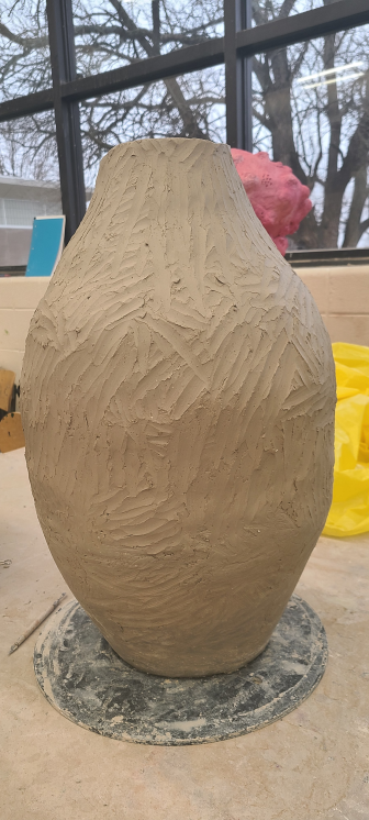
The next step took some extra hands as we flipped the pot over, allowing it to set on the clay slab bottom. I began coiling from what was left at the bottom, connected to the potter’s bat. From this stage, the coiling is done using the slip and score technique, and with every few layers of the coil, I would smooth the exterior and interior of the pot, so the vase begins to take on the desired shape. I would gradually place the coils further out on the rim of the previous coil to make the pot wider and gradually place the coils more inward on the previous coil to make the pot narrower as I constructed its shape.
The pot flipped over.
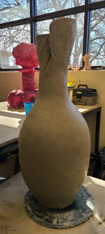
Once I was happy with the body’s bottom section, I began closing the coils, moving them inward with each layer. I continued to smooth the inside and outside of the vase the entire time I was constructing it. I formed a fluted-looking top for my vase, and for the lip section, I formed another slap to attach to the top piece and used a slip and score heavily here so that it would mold and connect without the risk of cracking and breaking off during the firing process. I coiled this layer around the top base of the vase while gently forming it to appear like a flower opening from its center. It looked like a single flower petal unwinding from the inside. I used a small and soft-ended mallet once it had sat for a few more days to tap along the neck and sides of the vase to give it the shape I wanted and smooth the exterior. I also used a clay shredder, which looks like a kitchen grader tool, to further shape the vase.
Beginning of centering the coils on forming the top.
Beginning of the fluted top.
Beginning the spiral of the fluted top.
Once I was satisfied with the shape, I let it sit for over two weeks. I sat it under plastic for around two or three days and gradually left the plastic open at the base. After those first few days, I removed the plastic to allow the vase to air dry completely.
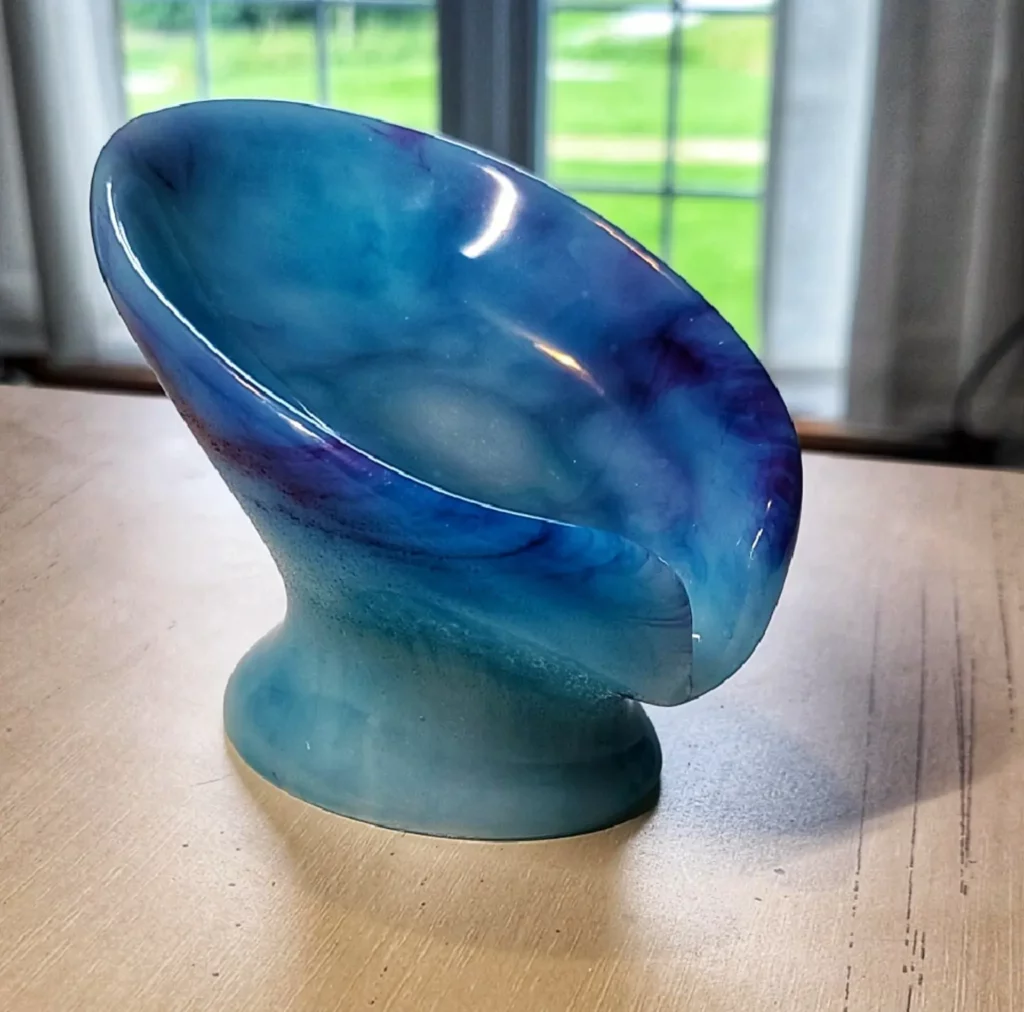
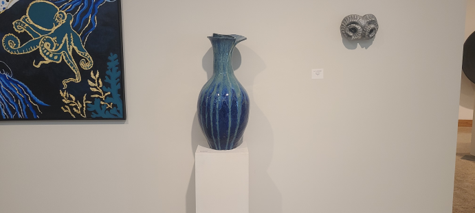
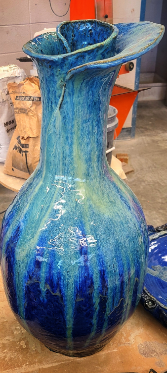
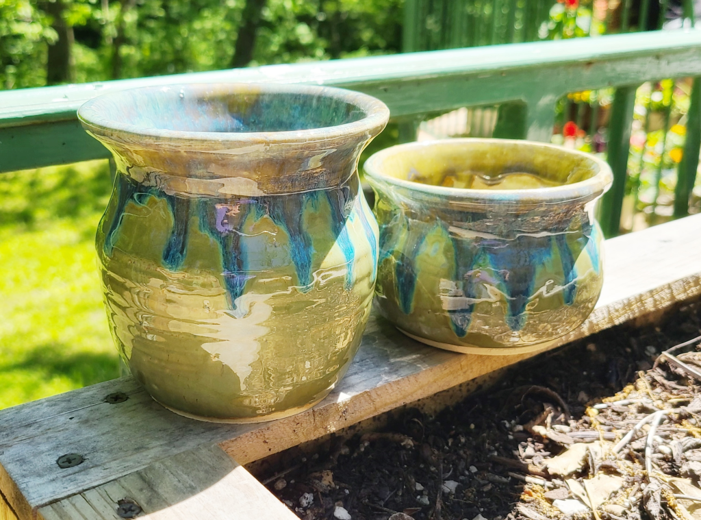
Next, it was time to choose the glaze colors. I ended up going against my professor’s choice and using the colors Indigo Float for the entire base, and I used a drizzling mop technique on the top lip and rim of the vase in Lustrous Jade. Both glazes are from the Amaco Potter’s Choice glaze. My professor did not think the colors would blend well layered over one another; he feared it would turn an off-color that I would not want. I had not seen the color combination anywhere. Even when I Googled the colors, it would show them in combination with other colors but not together. So, it was a happy surprise for us both when it came out in a stunning blue and vivid green drizzle.
These are the links to the glazes I used. You can find them on Amazon here:
It was a long and tedious process, but the result was terrific. It sat for an entire month in the center of the art exhibit inside the Daum Museum of Contemporary Art before I could take it home. I was thrilled to see it won in the art show too.
On display for the art show.
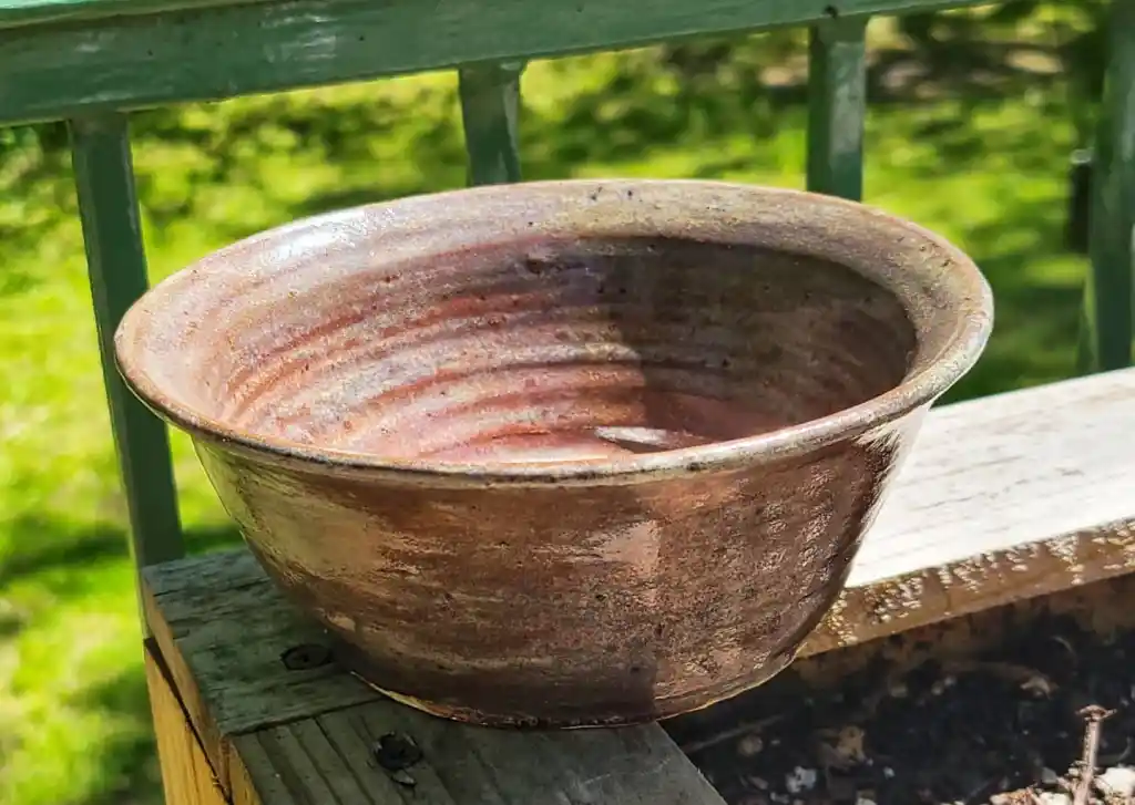
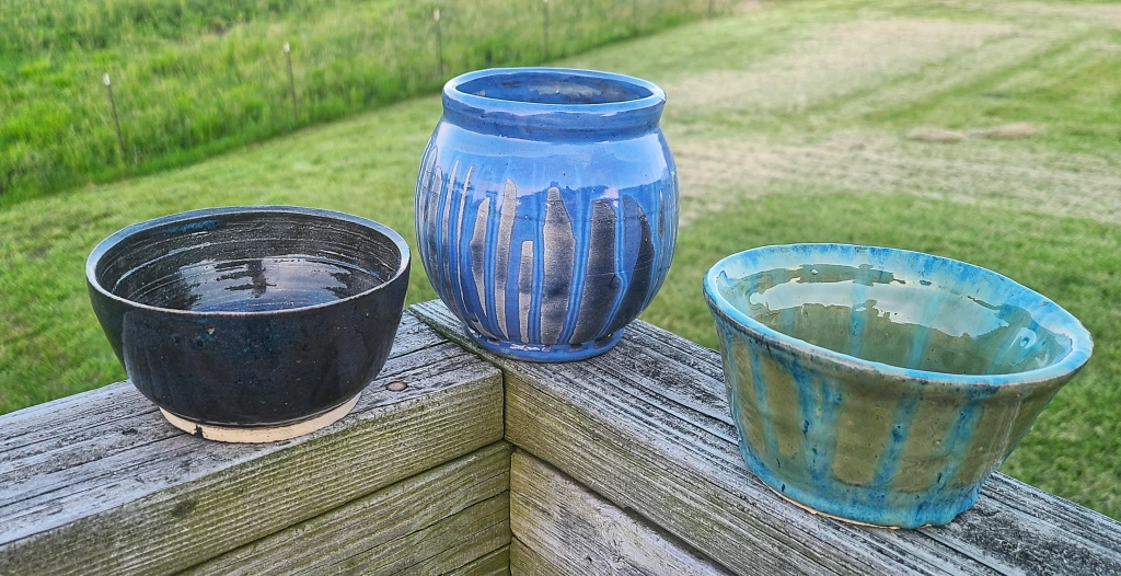
Below are some pictures of pieces that I have around my home that I learned on the potter’s wheel.
The professor fired the center pot too low, so only the top glaze fired correctly. However, he and I liked the surprise it gave to the bowl, and we decided to keep it this way.
Not long ago, I was asked to create a glass vase with a resin design for a 50th wedding anniversary gift. I was given specific instructions to use the traditional anniversary year color as one of the colors within the design. Still, ultimately, I could have free reign over the remainder of the work. A list of things needed to create resin vases includes the following:
Glass vase
Electric tumbler turner
Spray paint of your choice in color
Micas
Clear high gloss epoxy resin 1:1
Resin mixing cups for resin and enough for each mica color used
Freezer paper to cover your work area.
Nitrile or latex-free gloves
Paper towels
Popsicle sticks to mix resin and micas
Heat gun or kitchen cooking torch
Metal tin to place under the electric turner (optional)
Silicone resin spatula (optional)
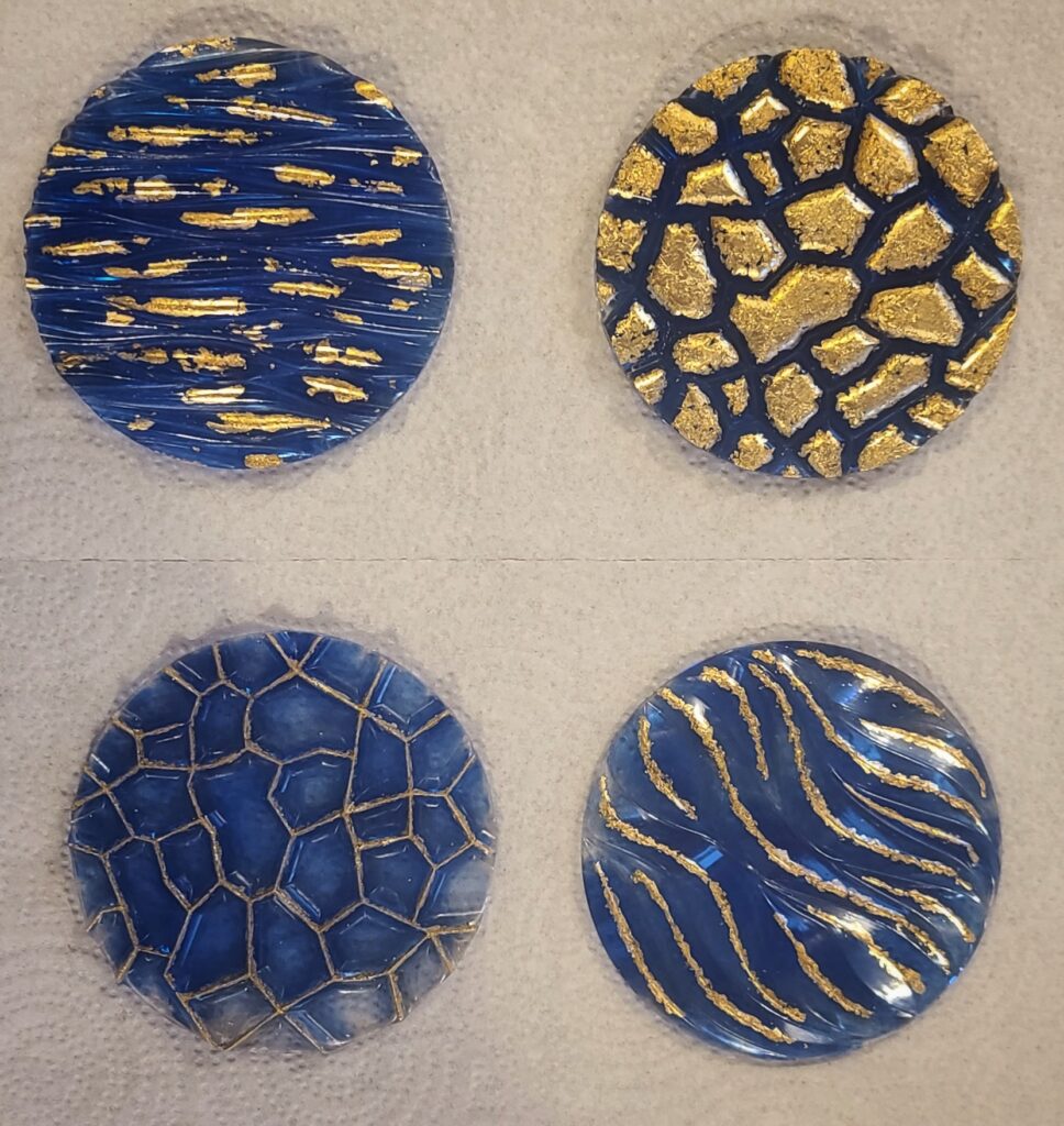
I ended up choosing more nautical color choices as sea colors can also enhance gold tones quite nicely. I picked a set of micas from my collection that had emerald, navy, gold, white, turquoise, light marine, pearl light blue, and a pearl black for a slight contrast to pair with the gold nugget sparkle mica I was going to be using.
When using resin, it is customary to prepare a safe area because the fumes from the raw ingredients can be harmful to some. I have not had any bad reactions, but I have seen and heard the stories from others. So, I use precautions just to be safe. I first lay out freezer paper along the surface of the table I use so that I do not leave any residue on my counters or my table and have a huge mess to worry about later. I also wear nitrile gloves when handling resin and mixing these two parts.
To begin, I set my glass vase on the paper next to the tumbler turner that I have placed on a tin tray (I’ll go over why I use a tin tray in a little bit). I used navy spray paint to lightly dust the vase for good coverage first because the resin can be transparent with some micas, plus the light dusting of paint can also help adhere the resin to the glass surface better.
Once the paint has dried for approximately five to ten minutes, depending on how heavy a layer is applied, I place the vase over the foam mount on the electric tumbler. I then measure out the micas into separate, clear, two-ounce cups. Keep in mind that you’ll need very little colorant to get the effect you’re looking for.
You will measure the amounts of parts A and B of the resin needed for the desired size vase you’re working with. When working with 1:1 ratio resin, it needs to be said to measure by volume, not weight. IT WILL NOT work otherwise. I ended up using around four ounces, perhaps a little more for this project. You will need to mix part A by itself for two minutes and repeat this same step with part B in its cup. Once both parts have been mixed separately, you’ll then pour part A into part B and be sure to scrape all of part A from its cup into part B for equal amounts to remain at a 1:1 ratio. Once both parts are in the same cup, you mix them for two to five minutes. The formula will get hazy in color and then go clear again. You will also find that air bubbles begin to form within the mixture, which is okay.
Next, you’ll want to decide how much of each color you want on your vase. You will first want to keep most of the transparent resin to coat the vase before adding colors. Once it is coated, you can add the rest of the colors as needed.
I used almost equal parts, except with black; I used a minimal amount of hinting in areas to break up some of the color patches here and there to aid in contrast and dimension. You will add some of the transparent resin into the cups of mica and blend them until they look smooth and no power is present. The texture will look like warm honey.
Next, turn the tumbler on and begin by adding some clear resin to the vase. I use my hands for this step, but some prefer to use a silicon resin spatula. I use my hands to feel (using gloves, of course) where all the resin has coated and sealed the vase. I do not want to miss places like the rim of the vase, for example. You will lightly allow the tumbler turner to do most of the work for you in this step by just holding your gloved hands along the glass surface until the resin has coated the vase evenly. Be sure to coat the bottom of your vase as well. I then wipe any resin off my gloves with paper towels.
Next, you’ll pick resin colors to drizzle in whatever pattern you choose over the vase as it turns on the tumbler. This is where the tin tray comes in handy; I can use the popsicle sticks to dip back into the resin and add drops to the vase if I need to. Pour the resin from the very top-facing side of the vase; gravity plays a crucial role in your design. The resin will move along the vase in marbled patterns as the tumbler spins. You can see the video from my Facebook page link found here: https://fb.watch/aOKyf-8oG1/
Go slowly when you add your colors, and keep in mind that as the vase turns, the resin colors will meet and blend, so be patient. Add resin to areas that need it by checking from eye level for dips in the resin surfaces. If you have clear resin left, a few drops here and there can add a neat effect to the colors and depth of the design.
Once you’re happy with all the resin applied, lightly fan a heat gun on the lowest setting or a kitchen cooking torch across the surface of the vase to pop any air bubbles that may get trapped in the resin. Do not get the heat too close to the resin; a few inches away is more than enough distance, and do not linger in one spot too long because you can end up melting your design very quickly and ruining your look.
Allow the vase to spin for around twenty minutes and check back. If you notice a lump on the bottom of the vase from the resin, take a popsicle stick or the silicone spatula while it’s turning and lightly swipe it to the rim. You’ll want to smooth it out for a flat surface. It is okay that the colors blend there; nobody focuses on the bottoms.
Traditionally, I allow my vases to spin in a closed-off room away from kids and pets for about twelve hours. I checked the vase every twenty minutes for its first two hours to ensure no lump was forming on the bottom.
Once it is dry, your project is complete, and no other steps are needed to enjoy your beautiful vase!
Painting landscapes has been one of my favorite styles of art I create. I may only be just beginning in this genre but learning the techniques and adapting my own sense of style to each piece is an addicting thrill for me. I’ve only been dabbling in this spectrum for a short time, but I have quickly learned that one needs not to have all the skills required by a sketch artist. I respect those who can draw with excellent precision; it is an artistic expression unlike any other in art. I will always say this skill is constantly evolving and adapting; I am improving through practice.
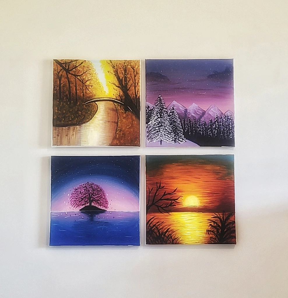
Some of my first landscapes were just for fun and to see my basic abilities in dealing with paint brushes. Once I was comfortable with how I was doing, I began to paint a quad set of 12×12-inch canvas paintings representing the four seasons. My colors were to be bright and inviting for the summer sunset, vibrant hues for the spring scene, relaxed and calm for the winter scene, and a warm glow for the fall scene.
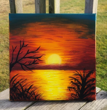
The summer painting is a silhouette style at sunset with the rich, warm, and inviting hues of the sun over water just at the golden hour of the evening. I used small amounts of blue and green and focused mainly on the rich reds, oranges, and yellow tones for the setting sun.
Summer Sunset
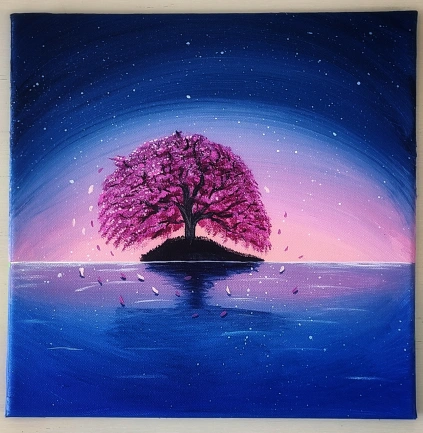
I chose to use magical blue, white, pink, and magenta hues for the spring painting. I used mainly pink and magenta within the cherry tree itself, but also used them to incorporate a spring glow to the setting sun background. I used a dark navy hue and black paint to complete the tree’s island so that it would appear almost like a silhouette scene. I made sure to shadow the falling blooms and the tree’s island in the darker navy hues so that it would give a better definition to the scene. I used white to splatter stars onto the sky and to accent the cherry tree trunk.
Cherry Tree Island
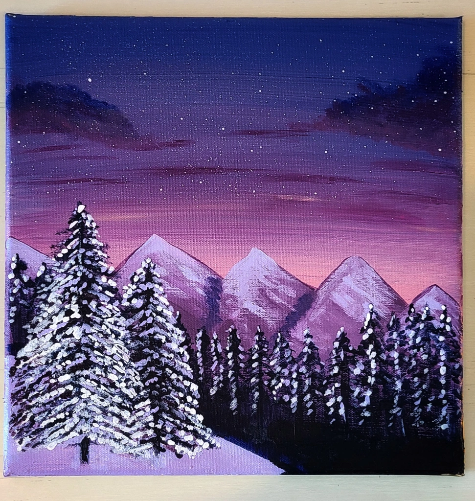
I chose to use variations of deep navy, purple, magenta, soft pink, Naples yellow, white, and black paints for the winter scene. The mountains were primarily hues of purple and white and snowcapped in white and pink variations. Naples yellow, deep navy, and soft pink hues gave the evening sunset a wonderful dimension. The snow-covered cedar trees came out okay; I still have more work to build the skills I would prefer for them, but I am a work in progress! I still enjoyed the paint-splattered stars on this piece.
Snow-Capped Sunset
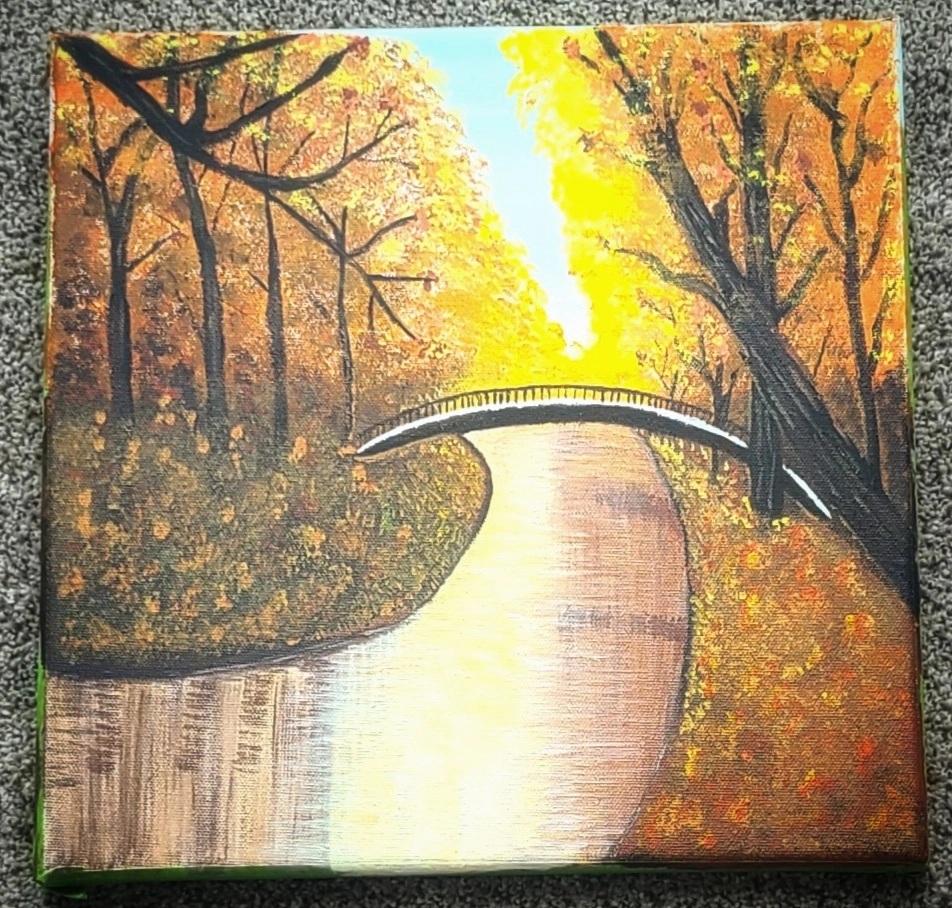
I chose warm and glowing hues for the fall scene. Most hues are variations of yellow, orange, red, forest green, white, black, and brown. I stretched some of my abilities on this piece and drew a bridge over a creek landscape. This piece tested every ounce of patience I have ever had. I tweaked this one so much I didn’t think I would ever like it. I used a wet sea sponge to create the floor of the forest and the farthest tree leaves so that it would be more defined the closer the forest leaves would be to the viewer. I used variations of brown and white to accent the bark on the trees. The brush strokes to create the creek were more drag marks with a small fan brush. I also used the smallest fan brush to define the tree trunk reflections. I used green, red, and orange paint to make the forest floor pop with some definition. The bridge was done in black and white, and I was okay with how it turned out, but I still feel my skills are growing regarding man-made objects.
Fall Bridge
Once the paintings were all completed, I hung them in my office as a set. I found that as a group, they looked well together. They took some time designing each one, but I am pleased with their results, and they covered a good size space behind my desk. I made sure to alternate their positions with warm and cool tones so that each looked beautiful in their own rights but fit equal to the design.
Four Seasons
I am slowly learning more with each piece, and my skills have improved in some aspects of each design I paint. This is one that I did just before the end of the 2022 summer. It was just for practice and only on an 8×10-inch canvas. I loved the pink and rich, cool hues I chose to reflect off the lake and mountain landscape in this piece. I was pleased with the definition of the mountains. However, I am still working on those cedar trees–Ha!!